Two open source repositories share Excel templates to help create oncoplot visualizations of gene mutations in patient populations and swimmer diagrams to explain patient stories.
Simple Excel Oncoplot
https://github.com/ptgrogan/excel-oncoplot
This repository contains a simple Excel spreadsheet for creating oncoplots to illustrate genetic mutations in a patient population. It does not require or depend on any other software to use. Edit the gray-shaded cells with a designated mutation type ID (below) to identify the observed mutation (rows) for each patient (columns).
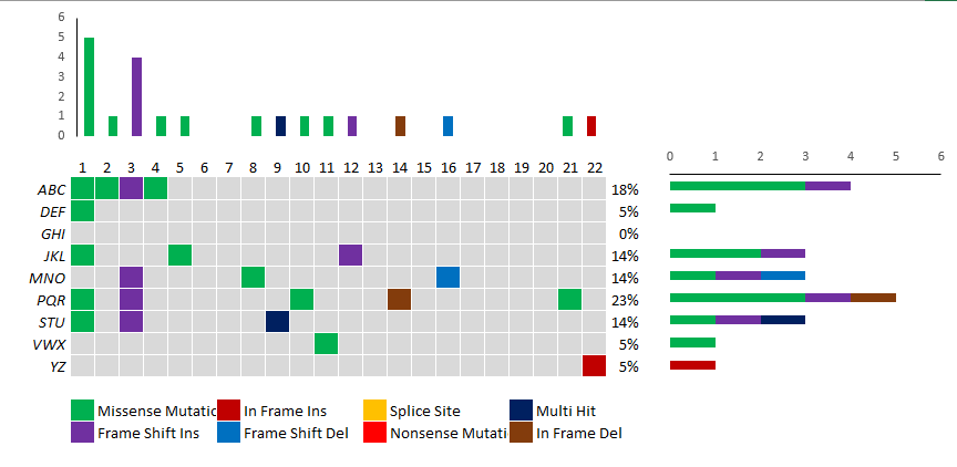
The default configuration identifies eight types of mutations (by type ID):
- Missense Mutation (green)
- Frame Shift Insertion (purple)
- In Frame Insertion (dark red)
- Frame Shift Deletion (blue)
- Splice Site (orange)
- Nonsense Mutation (bright red)
- Multi Hit (dark blue)
- In Frame Deletion (brown)
and specifies nine placeholder genes (rows) for 22 patients (columns).
A bar plot above indicates mutation type per patient and a bar plot to the right indicates mutation type per gene.
Add or remove genes by right-clicking on a row and selecting “Insert” or “Delete”. After inserting a new row, copy and paste the equations for the entire row from an adjacent row.
Add or remove patients by right-clicking on a column and selecting “Insert” or “Delete”. After inserting a new column, copy and paste the equations for the entire column from an adjacent column.
Simple Excel Swimmer Diagram
https://github.com/ptgrogan/excel-swimmer
This repository contains a simple Excel spreadsheet for creating swimmer plots to illustrate patient stories. It does not require or depend on any other software to use. Edit any of the cells with blue text to customize the swimmer plots which are available in both horizontal and vertical orientations.
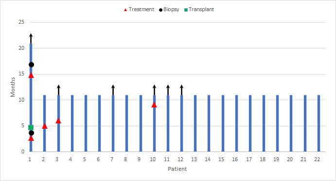
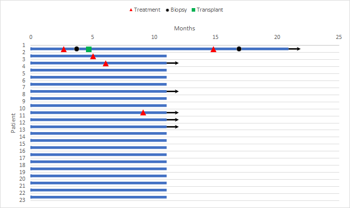
The default configuration allows for up to 100 data items in five categories:
- Patient Information — sets the bounds for a swim lane bar (ID, History Start Date, History End Date)
- “Treatment” Event — adds a red triangle to the swim lane (Patient ID and Date)
- “Biopsy” Event — adds a black circle to the swim lane (requires Patient ID and Date)
- “Transplant” Event — adds a green square to the swim lane (requires Patient ID and Date)
- “Alive” Indicator — adds an arrow to the end of a swim lane (requires Patient ID)
If you add or remove patients, adjust the chart axis limits to ensure all are visible (left click to select patient axis, right click and select “Format Axis…”).
If you add or more events, edit the chart series (right click, select “Select data…”, click “Add” or “Remove”, similar to existing event series).